
Understanding Cancer Death Rates

Cancer death rates are one of the best measures researchers use to track progress against cancer. American Cancer Society researchers publish the latest cancer death rates each year in the Cancer Facts & Figures report and on the Cancer Statistics Center website.
What “Cancer Death Rate” Means
A cancer death rate is also called a cancer mortality rate. It describes the number of cancer deaths (the number of people who die from cancer) out of 100,000 people in one 1 year. Typically, researchers look at the most recent 5 years that have data available.
For example, the cancer death rate in men in the United States during 2012 through 2016 was 193. This means that 193 men out of every 100,000 men died from cancer each year, on average, during those 5 years.
Where the Numbers Come From
In the US, death rates are based on the underlying cause of death listed on death certificates. These records are kept and reported by each state and collected by the Centers for Disease Control and Prevention’s National Center for Health Statistics (NCHS). The underlying cause of death is the health condition that began the chain of events that led to a person's death. For example, if someone dies from pneumonia that was caused by lung cancer, the death will be counted in statistics for lung cancer, not pneumonia.
Data about deaths tend to lag about 2 to 4 years behind the current year. That’s because it takes time to collect, compile, check the quality, and make the information available. To learn more about death statistics in the US, see the National Vital Statistics Center web site.
Adjusting for Age
Researchers can calculate or use software to adjust cancer death rates for age, which they need to compare groups of people and track the rates over time.
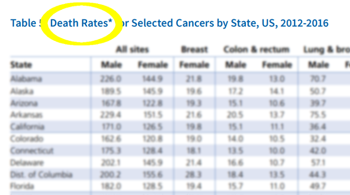
Cancer is mostly a disease of older people. Without adjusting for age, cancer death rates in Florida (217 per 100,000), which has a lot of elderly people, seem much higher than those in Alaska (133 per 100,000), which has a lot of young people. After adjusting for age, it’s clear that cancer death rates are actually higher in Alaska than in Florida, 165 versus 152.
Why Use Death Rates Instead of Numbers of Deaths?
Numbers of cancer deaths show how cancer affects certain groups of people. However, researchers can't use the number of cancer deaths to compare groups because that number doesn't take into account the size or age range of different groups, which is why when researchers need to compare groups, they calculate the death rate.
Researchers also need to use age-adjusted cancer death rates to track trends over time. That’s because the number of people in the world is growing and everyone is getting older. That’s why even though the number of cancer deaths keeps increasing, the cancer death rate has been decreasing since 1991.
Cancer death rates versus counts for all cancer types combined, United States, 1990-2016
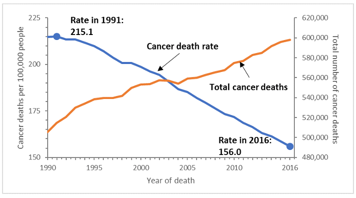
For instance, the number of cancer deaths in the US increased from 514,684 in 1991 to 598,038 in 2016. Yet the cancer death rate decreased 27% from 1991 (215 per 100,000 people) to 2016 (156 per 100,000 people). These trends show progress against cancer. The decline in the death rate is largely due to fewer people smoking. Improvements to the ways we can prevent, find, and treat cancer have also lowered the death rate.
While cancer death rates let us understand trends and compare groups, they don’t tell us about one person’s risk of dying from cancer. That’s because cancer death rates do not account for a person’s risk factors for getting cancer, other health problems they may have, or how well they respond to treatment.
- Helpful resources
- For researchers
American Cancer Society news stories are copyrighted material and are not intended to be used as press releases. For reprint requests, please see our Content Usage Policy.

